top of page
All photography is my own.
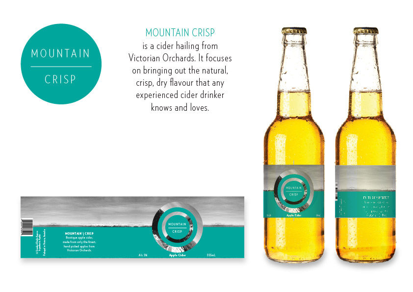
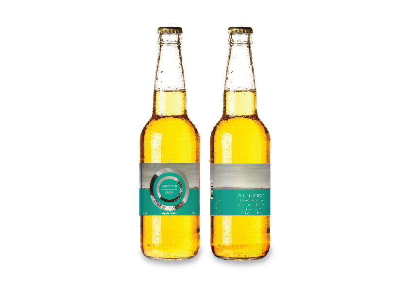
The aim for this design was to keep it minimalistic and let the flavour do the talking. The logo features a photo of a mountain that has been twisted on its axis inside a circle. The twisting of the image is used to illustrate the nature of drinking. Where the bottle is 'tipped' to let the drinker consume the liquid.
Mountain Crisp cider packaging concept design

1/3
MOUNTAIN CRISP
Boutique Cider Packaging Design
Other Projects


JARRED SWIRE / DESIGN
T: 0408 111 516
bottom of page